Add InstantSearch and Autocomplete to your search experience in just 5 minutes
A good starting point for building a comprehensive search experience is a straightforward app template. When crafting your application’s ...
Senior Product Manager
A good starting point for building a comprehensive search experience is a straightforward app template. When crafting your application’s ...
Senior Product Manager
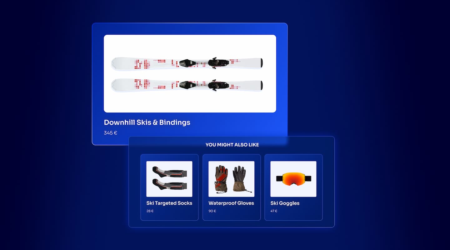
The inviting ecommerce website template that balances bright colors with plenty of white space. The stylized fonts for the headers ...
Search and Discovery writer
Imagine an online shopping experience designed to reflect your unique consumer needs and preferences — a digital world shaped completely around ...
Senior Digital Marketing Manager, SEO

Winter is here for those in the northern hemisphere, with thoughts drifting toward cozy blankets and mulled wine. But before ...
Sr. Developer Relations Engineer

What if there were a way to persuade shoppers who find your ecommerce site, ultimately making it to a product ...
Senior Digital Marketing Manager, SEO

This year a bunch of our engineers from our Sydney office attended GopherCon AU at University of Technology, Sydney, in ...
David Howden &
James Kozianski

Second only to personalization, conversational commerce has been a hot topic of conversation (pun intended) amongst retailers for the better ...
Principal, Klein4Retail

Algolia’s Recommend complements site search and discovery. As customers browse or search your site, dynamic recommendations encourage customers to ...
Frontend Engineer
Winter is coming, along with a bunch of houseguests. You want to replace your battered old sofa — after all, the ...
Search and Discovery writer

Search is a very complex problem Search is a complex problem that is hard to customize to a particular use ...
Co-founder & former CTO at Algolia

2%. That’s the average conversion rate for an online store. Unless you’re performing at Amazon’s promoted products ...
Senior Digital Marketing Manager, SEO

What’s a vector database? And how different is it than a regular-old traditional relational database? If you’re ...
Search and Discovery writer

How do you measure the success of a new feature? How do you test the impact? There are different ways ...
Senior Software Engineer

Algolia's advanced search capabilities pair seamlessly with iOS or Android Apps when using FlutterFlow. App development and search design ...
Sr. Developer Relations Engineer

In the midst of the Black Friday shopping frenzy, Algolia soared to new heights, setting new records and delivering an ...
Chief Executive Officer and Board Member at Algolia

When was your last online shopping trip, and how did it go? For consumers, it’s becoming arguably tougher to ...
Senior Digital Marketing Manager, SEO

Have you put your blood, sweat, and tears into perfecting your online store, only to see your conversion rates stuck ...
Senior Digital Marketing Manager, SEO

“Hello, how can I help you today?” This has to be the most tired, but nevertheless tried-and-true ...
Search and Discovery writer
Did you know that 86% of the global population uses a smartphone? The 7 billion devices connected to the Internet represent 55% of the worldwide web traffic. It’s different by continent, too. In Africa and Asia it represents more than 70% of Internet traffic, about a third in North America, and about 53% in Europe.
Of course, that’s purely by region. When we look more specifically by industry we see that retail dominates the game with over 73% of mobile web usage.
So what does this teach us?
Ultimately, that mobile is not simply a “nice-to-have.” Businesses need to invest into a mobile-first experience especially if they want to keep ahead of their competitors.
As someone who has worked with Algolia for 9 years in both product engineering and customer success, and worked with hundreds of customers to build engaging search and discovery solutions, I’d like to share some ways to improve the mobile experience.
This content was originally presented at Algolia DevCon September, 2023
But before we jump into best practices, let’s remind ourselves that interacting with a mobile device is way different than a desktop. First of all, not only are screens smaller, but we also interact with our fingers which are more prone to errors. Often we’re on the move, facing connectivity issues and dealing with a distracting environment. It leaves us with less control over the website or mobile app we interact with.
Not only that, when designing a mobile experience it’s important to keep in mind that everyone has a different level of comfort, tech savviness, and domain knowledge when using a mobile browser or native mobile app.
Intent is another factor to consider. For example, let’s imagine someone is looking to purchase a new pair of shoes. They might visit several websites to compare the different shoes. Eventually, they find one to buy and place an order. The next day, they go back to check on the order. And the next day after, they look again to see the status of the delivery. So, same website, three different intents.
Before optimizing your mobile website usability, it’s really important that you think in terms of the user’s journey. What are their goals and motivation? What are pains and friction that may be causing them to drop out of the session? In these scenarios, it’s best to do direct customer research with your users live or remote via a tool like UserTesting.com or HotJar. There are other resources, too, for learning best practices which I’ll share at the end of this article. For now, however, let’s dig into the 10 best practices.
I should note that while I use examples from retail ecommerce, many of these best practices apply to other use cases and industries.
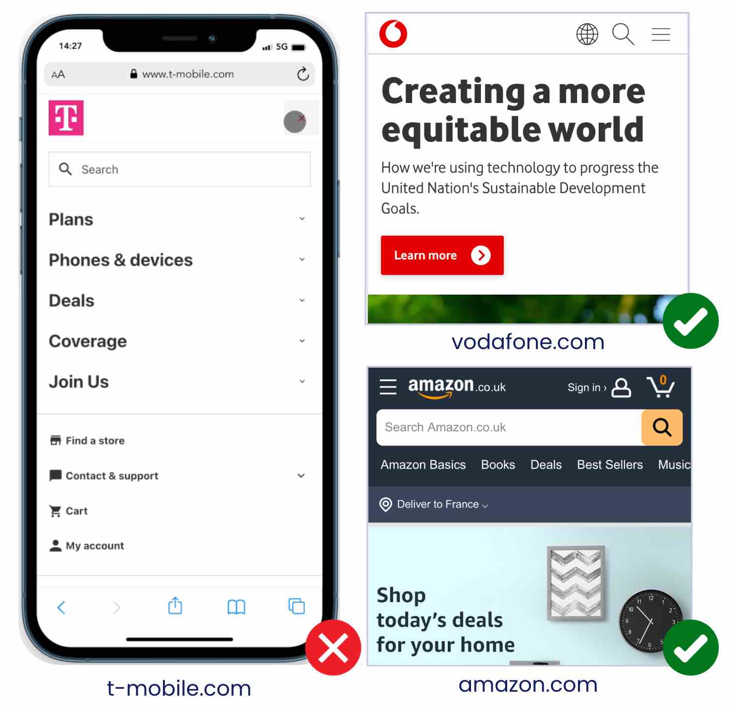
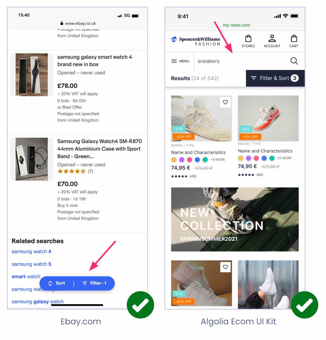
Mobile users expect to see the search on the top right of a mobile app or mobile web browser experience. So make it visible. Make it one tap away. Don’t hide it behind a burger menu or navigation, and make sure that it visually extends so users don’t really don’t have to search for it on the UI. Try to avoid distraction near the search bar as well. This is a common pitfall because businesses tend to put banners on the very top or similar looking icons, making it harder for users to find the search bar.
In e-commerce, as over 60% of people start their session with search, it’s a best practice to make it a predominant search box like on Amazon where it takes the full screen width. Another best practice is to use placeholder text informing your users what they can search for.
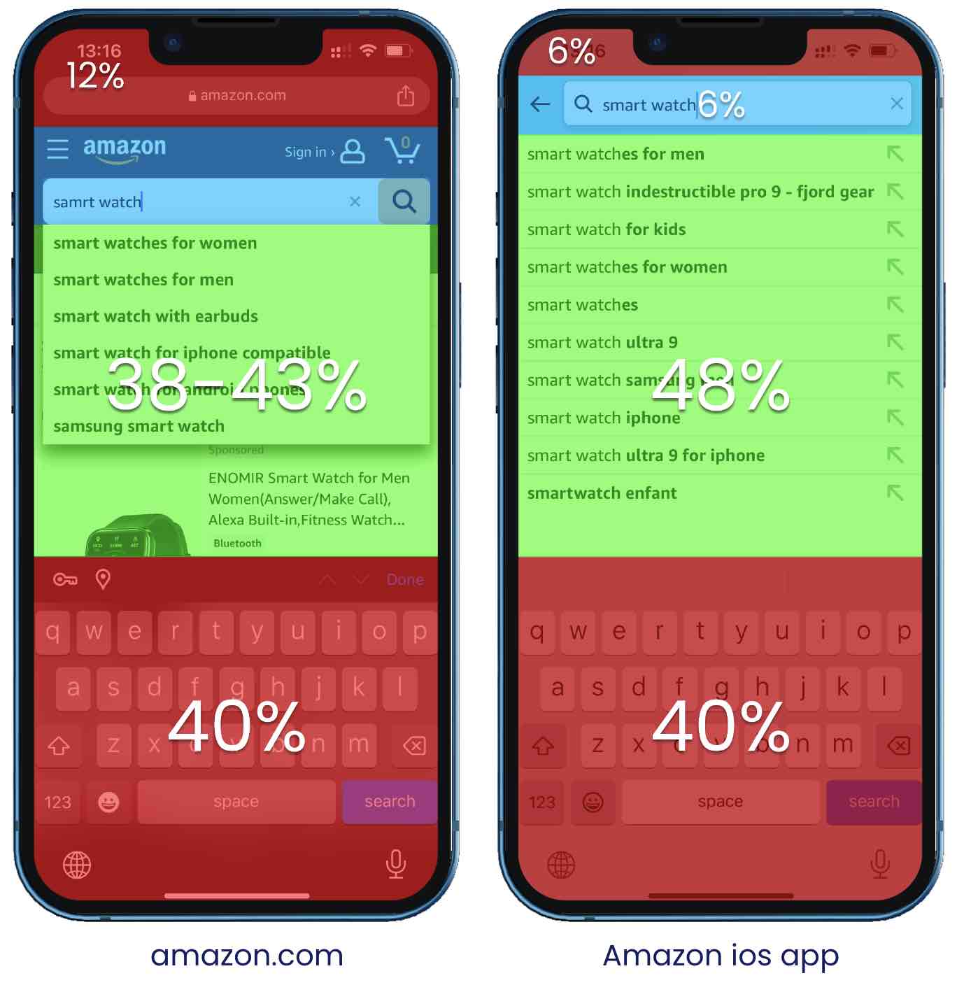
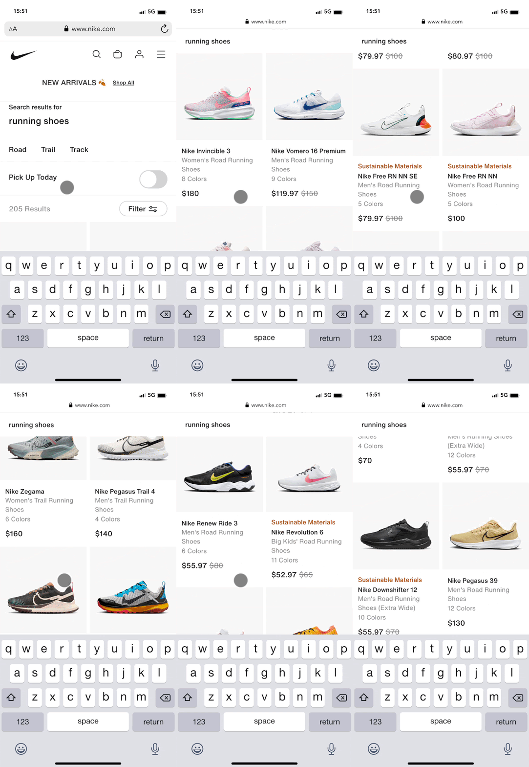
Caption: always test search on a real device so you can see the actual space the keyboard takes on screen
Once a user clicks on the search icon or field, you want to make sure that you maximize the screen real estate. How? By putting your search input at the very top using an autocomplete overlay. On a mobile device, due to screen constraints, actual space is around 48%. On mobile web it’s even less — just 43%.
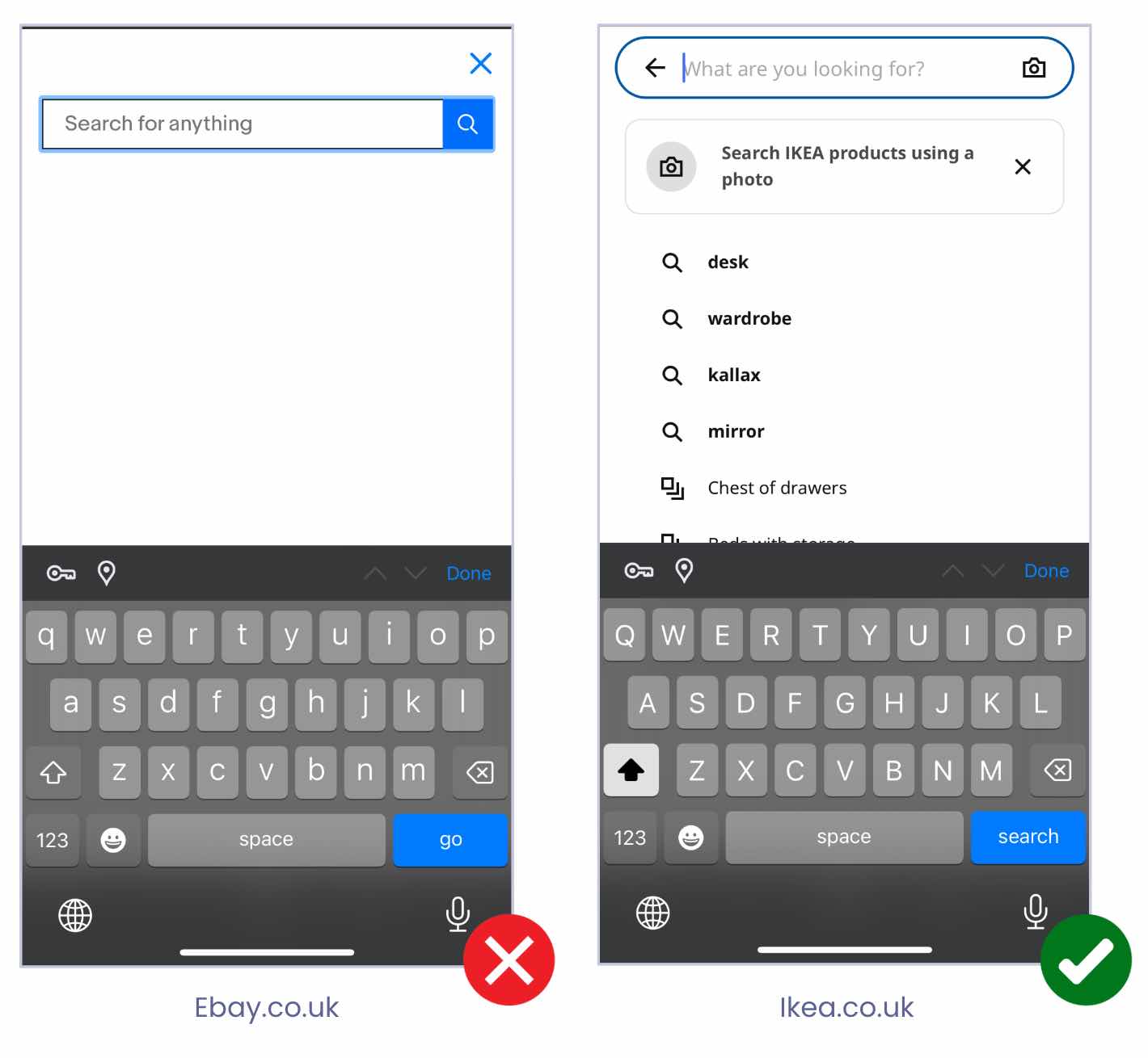
After customers have located your search icon and clicked on it, they will land on a screen which we call an ‘empty query state’. This is a great opportunity to start inspiring your visitors with useful content. For instance, for your first-time users, you could display popular searches. For returning visitors, many websites display “Recent searches”. It’s also a good opportunity to provide quick access to additional functionalities. Ikea, for example, promotes their image search functionality. Some other websites also use it to promote thematic pages like FAQs, blog content, …
Autocomplete attempts to predict results as customers type. Suggested search terms (a.k.a “Query suggestions”) takes it a step further and offers even more convenience for mobile users working on a small screen. A best practice is to display 6 to 8 query suggestions which might include recent searches they or other customers have done, or specific “in category suggestions” which allow users to go straight away into the taped category. Furthermore, don’t miss on the opportunity to support “non product searches” and offer in addition to query suggestions and product results other types of content: such as FAQs, blog posts, or other important pages.
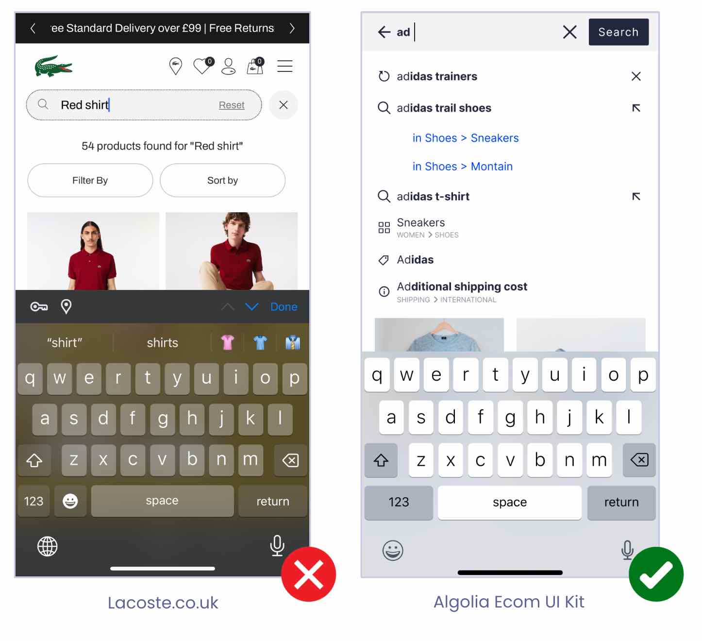
In the screenshot above you’ll see a small arrow next to some suggested queries. This is what we call the “tap ahead”. This pattern is very convenient for users as it allows them to tap a suggestion to fill in the query; it won’t submit the query, but it will just fill it in. They can then complete it with additional search terms before submitting.
Last, don’t miss on the opportunity to return suggestions from the first keystroke: it reinforces the feeling of speed and control for the user.
On the Search Listing Page (SLP), you want to persist the search query. This is a must-have. Not only does it inform the user about what they’re searching for, but it also gives them direct access to the query so they can refine it (over 50% of users required two or more query iterations on average). You will also want to provide easy access to sorting and filtering options. In the example below, you can see a horizontal row of options for filtering and sorting with the most popular filters available in one tap.
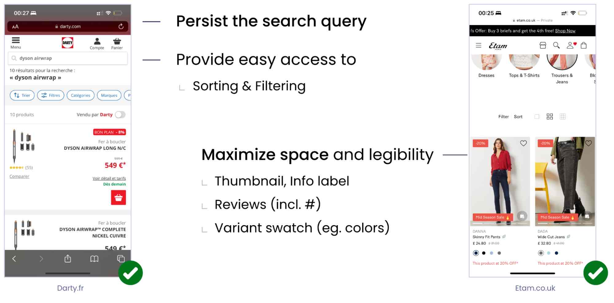
You will want to maximize space and legibility of your product listing thumbnails displaying as much information as you can. Reviews are really important, too. In this example above, visitors can easily see and click on the reviews and other dynamic product information, such as product colors and variants.
You should adapt the layout to the content type. By content types, I’m referring to two categories broadly: — visually driven results and spec driven results.
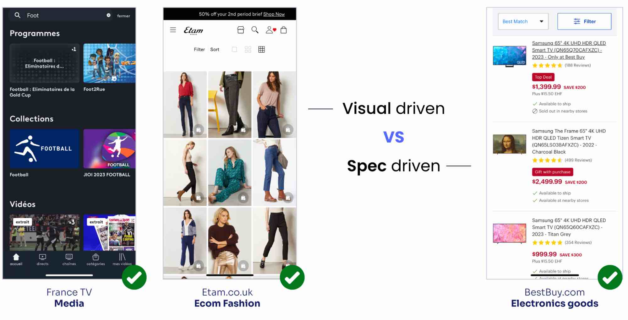
The image on the left above is an example of visual-driven results. Many ecommerce sites go this route because their products lend themselves to this kind of “window shopping.” But, there are also cases where users make decisions based on specifications and product attributes. This is what we call spec-driven. Visual-driven content can often be displayed in a grid, but with spec-driven content it’s typically better to to go with a list layout. Often, some mobile apps or mobile sites offer the possibility of switching between one or the other to match user preferences.
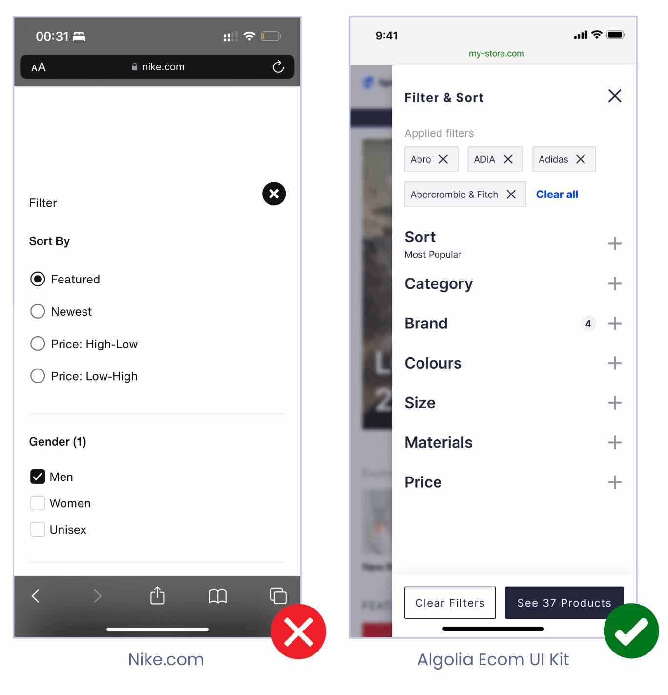
Filter overlays can be useful, but they’re even more useful when they only cover the page partially (learn more). You can display results behind the filter overlay. As soon as the users select a filter value, results are refreshed in real-time in the background. This is a great way to reinforce the speed and control perception from the user. For example, if a customer was to click on Brand results (in the screenshot above), it would filter instantly in the background. For this, we can use Algolia’s InstantSearch libraries which provide that behavior out of the box.
By default, it’s important to keep the filter option collapsed so users can get a breath of the available filtering options at a glance.
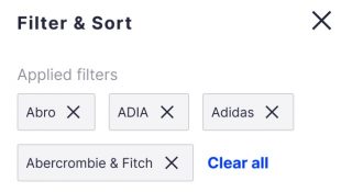
When a user refines results, you want to display active filters in an overview (like in the example below) from where they can easily remove them one by one, or all at once, along with displaying those at their original position.
Another best practice is to only display filters that relate to their search, and to minimize filters so as to make it easier for customers to find what they need. Dynamic filters are also referred to as facets. There is no need to display filters related to TV features (eg. TV size) if the visitor is searching for a vacuum cleaner. Also, order filters by popularity (often categories, brands, color, reviews and price are the most used filters). And last, make sure that you provide a sticky button to apply on those filters so users, again, don’t have to scroll and try to find where they should apply them.
How? By providing easy access to the current query and refinements. Some websites do it using a sticky menu on the top of the page so users can easily and quickly access search even when they scroll to the bottom of the site.
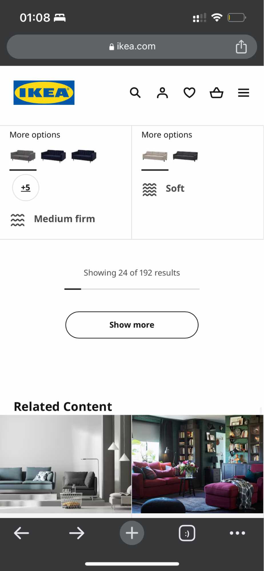
Infinite scrolling is very tiring on Mobile Web. It prevents users from accessing the footer of your site.
Alternatively, you can use a “Show more” button to allow your visitors to view as much as they want, and/or a progress bar which let’s users know how much content or how many products are available to them.
Finally, no results should not be a dead end for your customers. There’s a lot you can do to reduce no results:
Select a robust search engine that allows you to avoid no- or null-results at any cost so your users don’t have to deal with that situation.
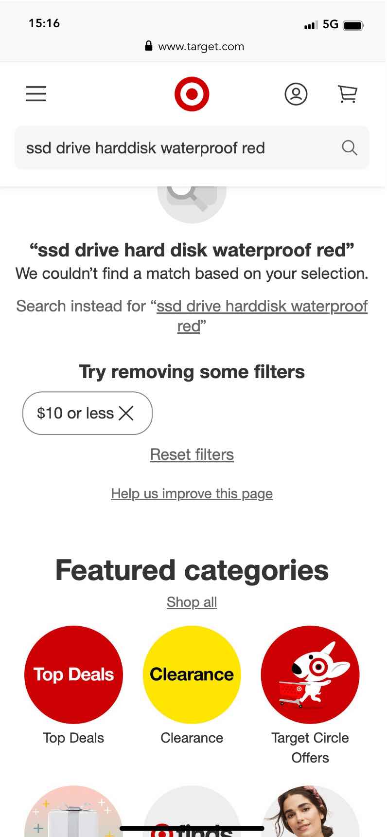
However, if a customer does arrive on a no-results page, it’s a good practice to try to inform them on how they can rephrase their query or help them by removing active filters. Like in the example above, I searched for < $10 products on target.com and no product matched my query with this filter. So, having the UI remind me that the filter is active, and allowing me to remove it in one tap enabled me to get back to a set of results.
Ultimately, as a last fallback, you want to show popular and/or featured categories so you users can continue their exploration journey without feeling blocked or lost.
As you can see, there are a lot of UI details to think about when building a robust search experience. Because It’s hard to keep all of them top of mind we created a Search & Discovery UI Kit, available for free on Figma Community.
Finally, if you’re interested to explore more recommendations, we suggest you check out the following sites:
Powered by Algolia Recommend